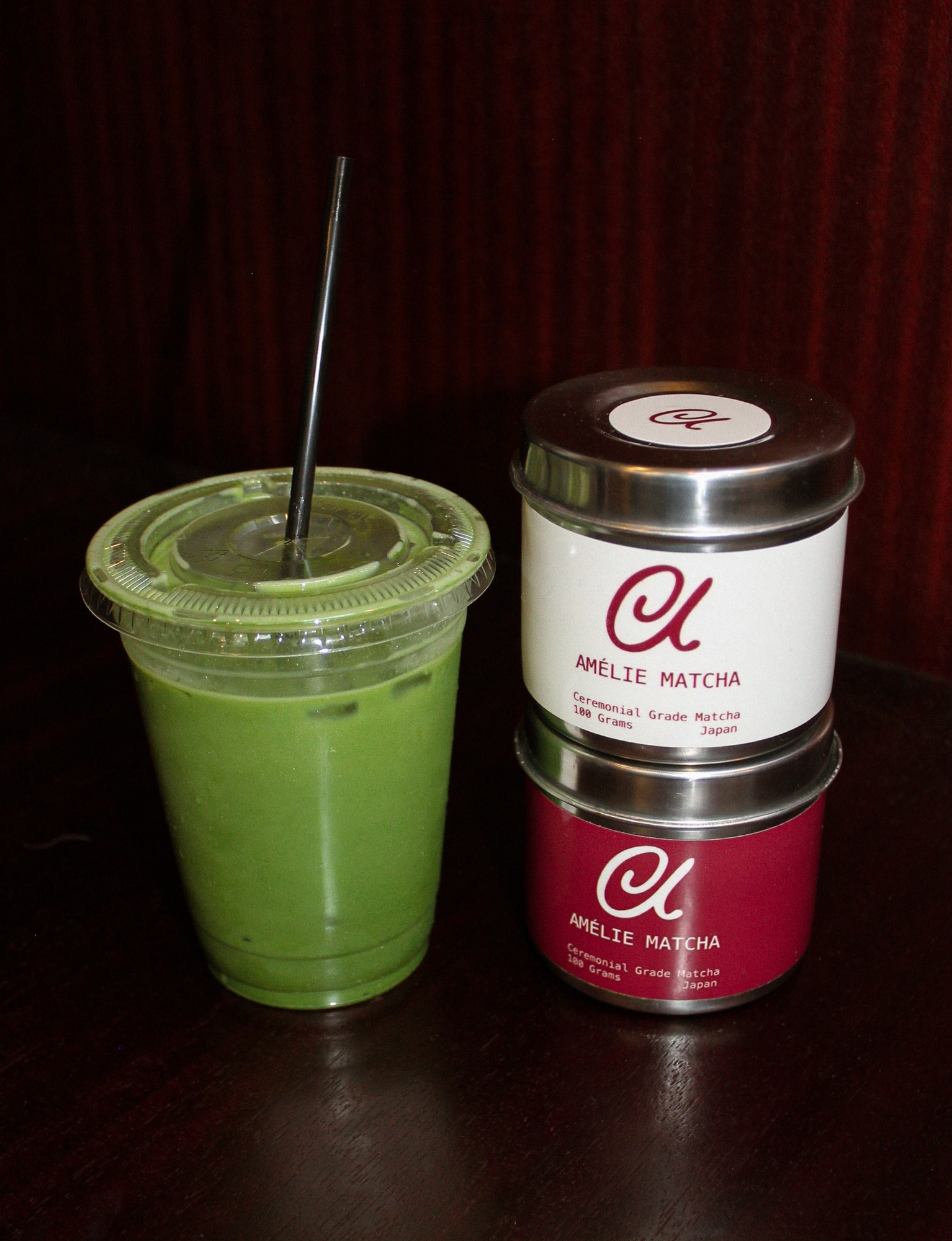
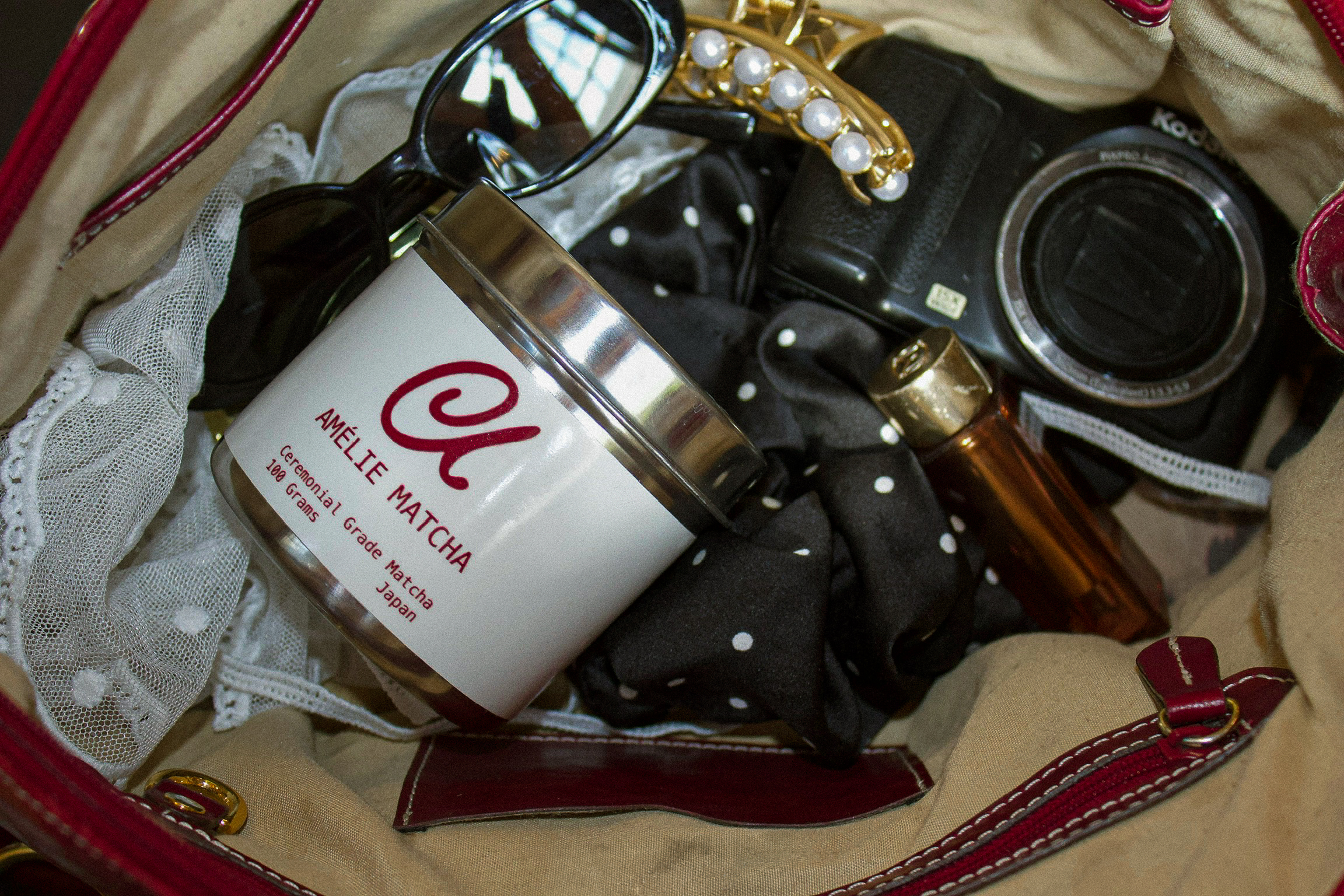
Amélie Matcha
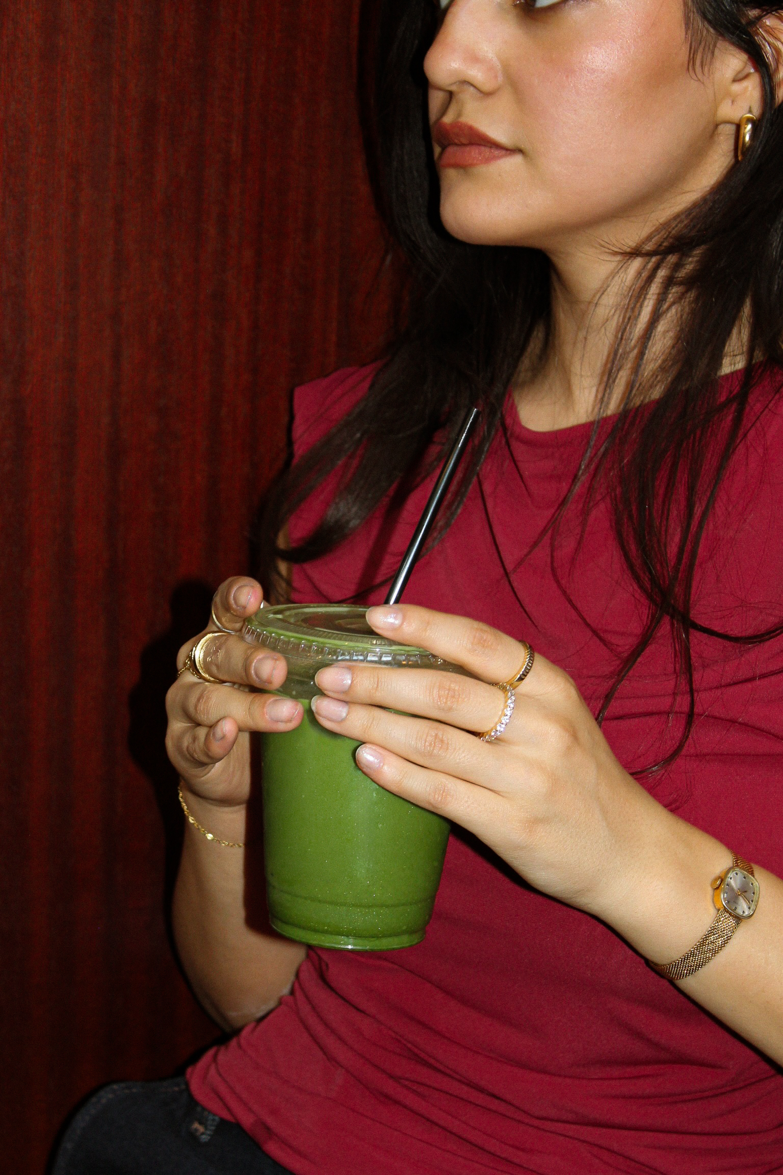
Amélie Matcha is a specialty tea company with a focus on high-quality ceremonial-grade matcha, rooted in the idea of intentional, everyday living. Influenced by European café culture, the brand embraces purpose over rush—elevating even the simplest moments into something beautiful and meaningful.
For this project, I created a brand identity that reflects this softer, more romantic outlook on lifestyle. The challenge was to differentiate Amélie Matcha from other companies with a different approach. Through storytelling driven design, the identity positions Amélie Matcha as more than just a drink—it becomes a ritual, a feeling, and a small but intentional part of living une vraie vie, a real life.
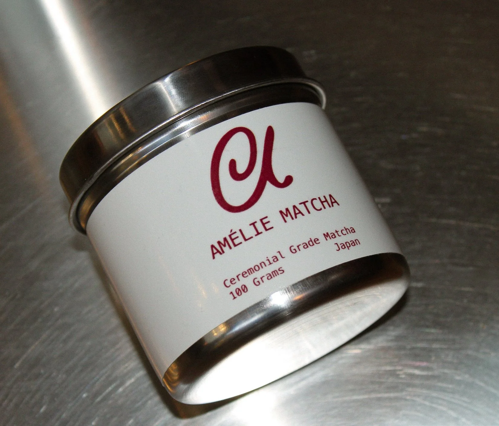
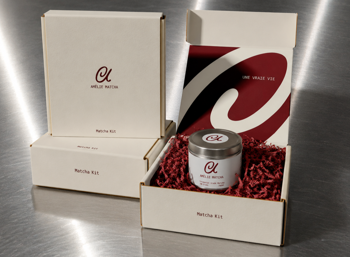
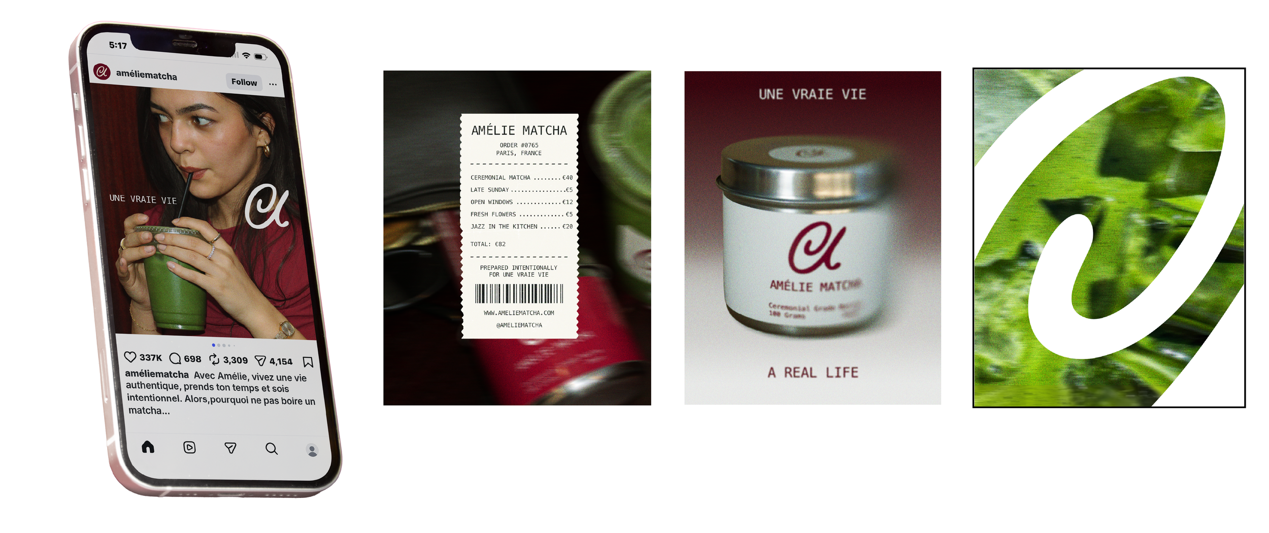
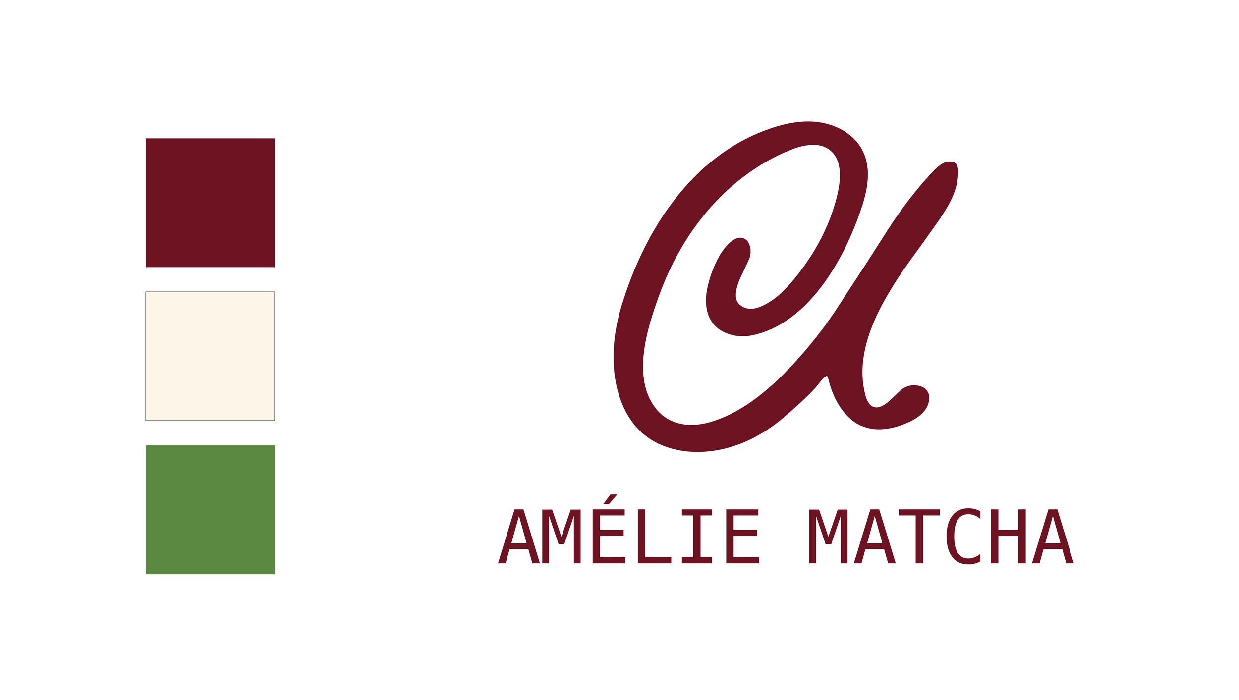
Amélie Matcha’s logo was designed to feel both refined yet personal, reflecting the brand’s values of intentionality and elegance. The hand drawn monogram is organic and soft, with a swirl in the counter bringing to mind movement and a nod to the circular motions used to make matcha. The handmade quality communicates the aspect of thoughtfulness and purpose instead of rush and distracted uniformity among the crowd.
The color palette was designed to differentiate Amélie Matcha from the visual language often seen within the matcha market. While many brands rely on monochromatic greens and minimal neutrals, Amélie introduces a rich red to bring warmth and contrast into the identity. As complementary colors, the red tones naturally enhance the vibrancy of the matcha itself, allowing the product to feel more vivid and elevated while reinforcing the brand’s expressive mood.