Dispatch Coffee
Dispatch Coffee is a family owned coffee shop in Tennessee that began with a dream and a coffee trailer. The name "Dispatch" references movement, travel, and sending something out into the world, reflecting the business's mobile beginnings and the journey that transformed it into a permanent café. Built around family, the shop's children and parents work side by side, creating a welcoming and personal experience for their community.
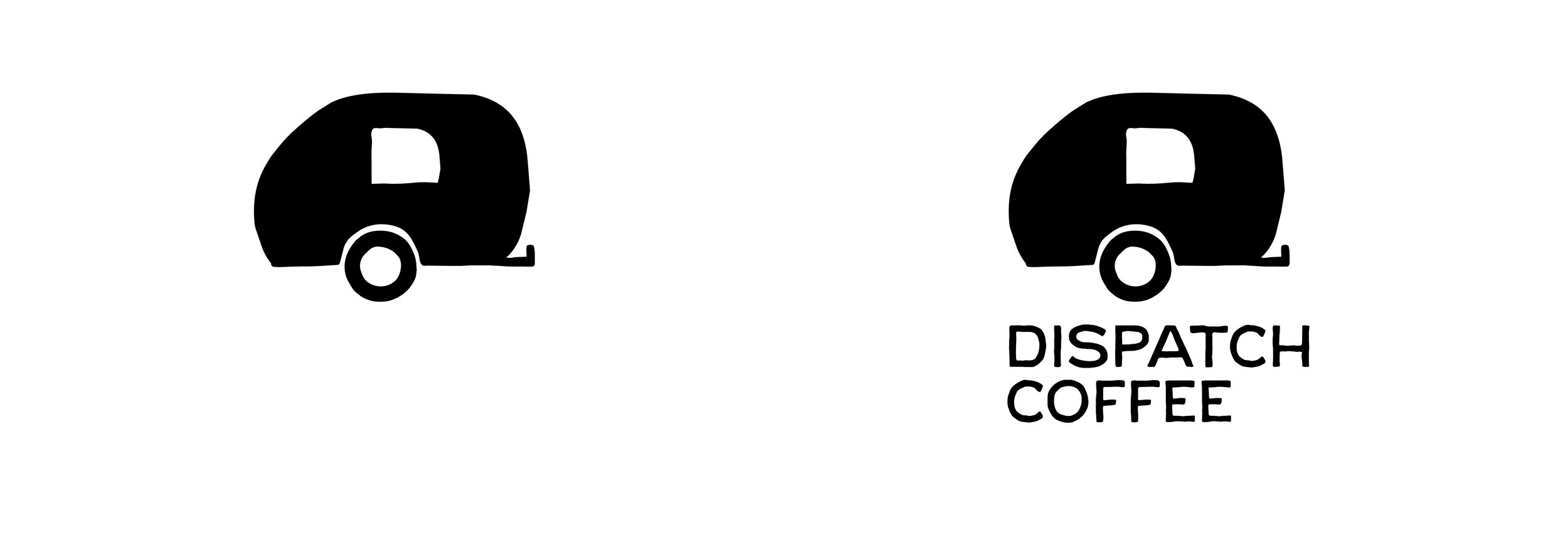
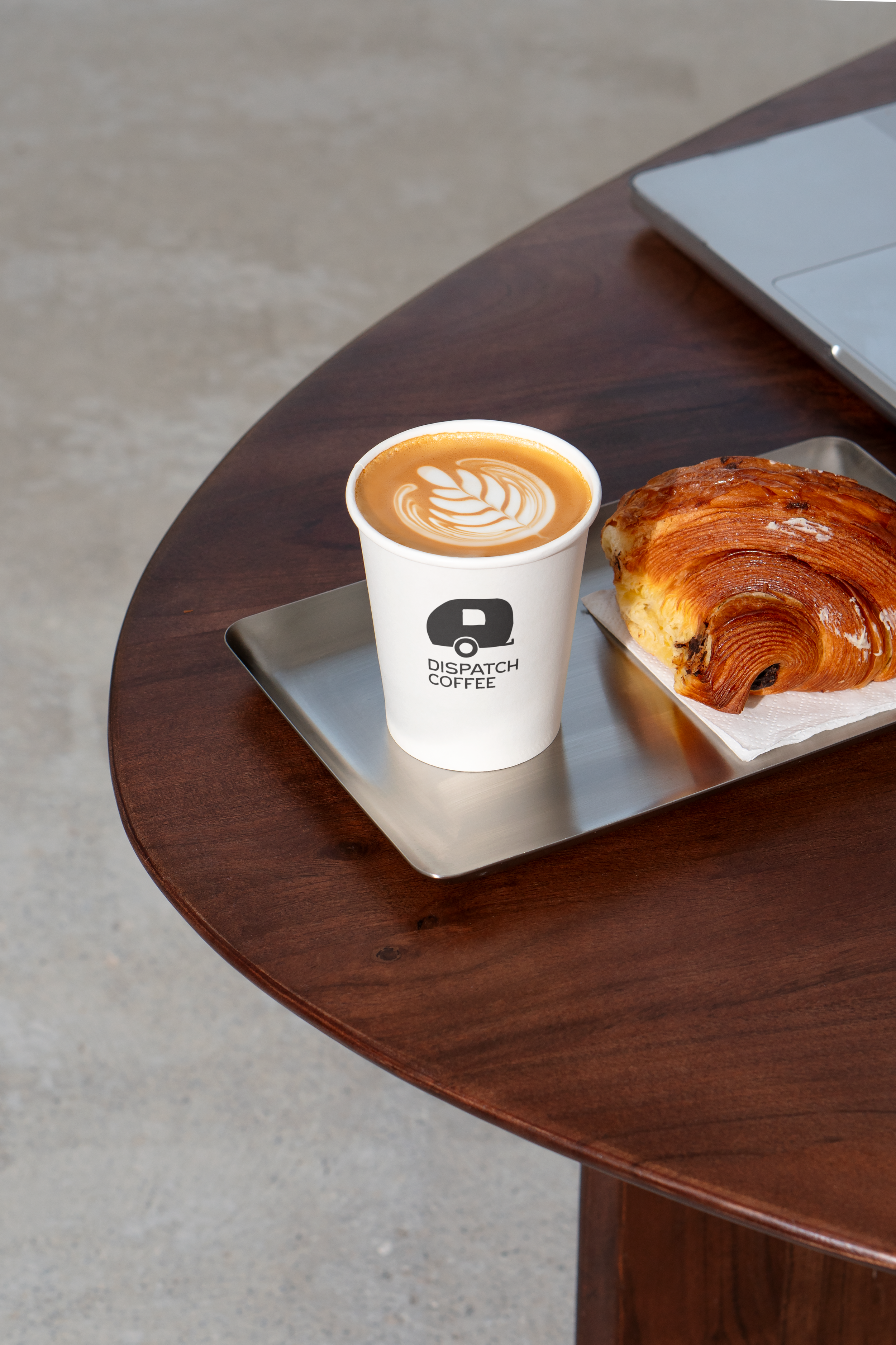
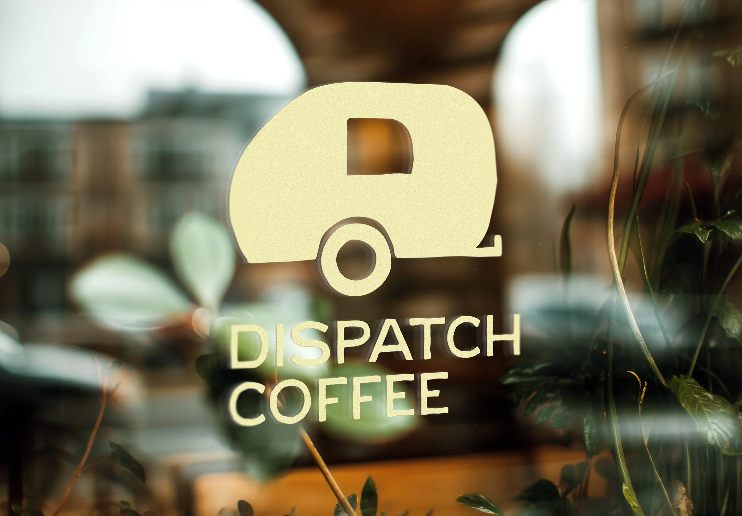
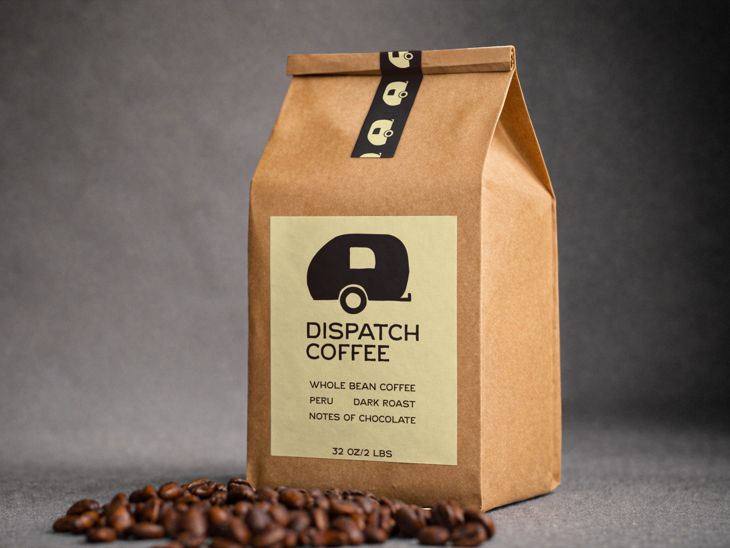
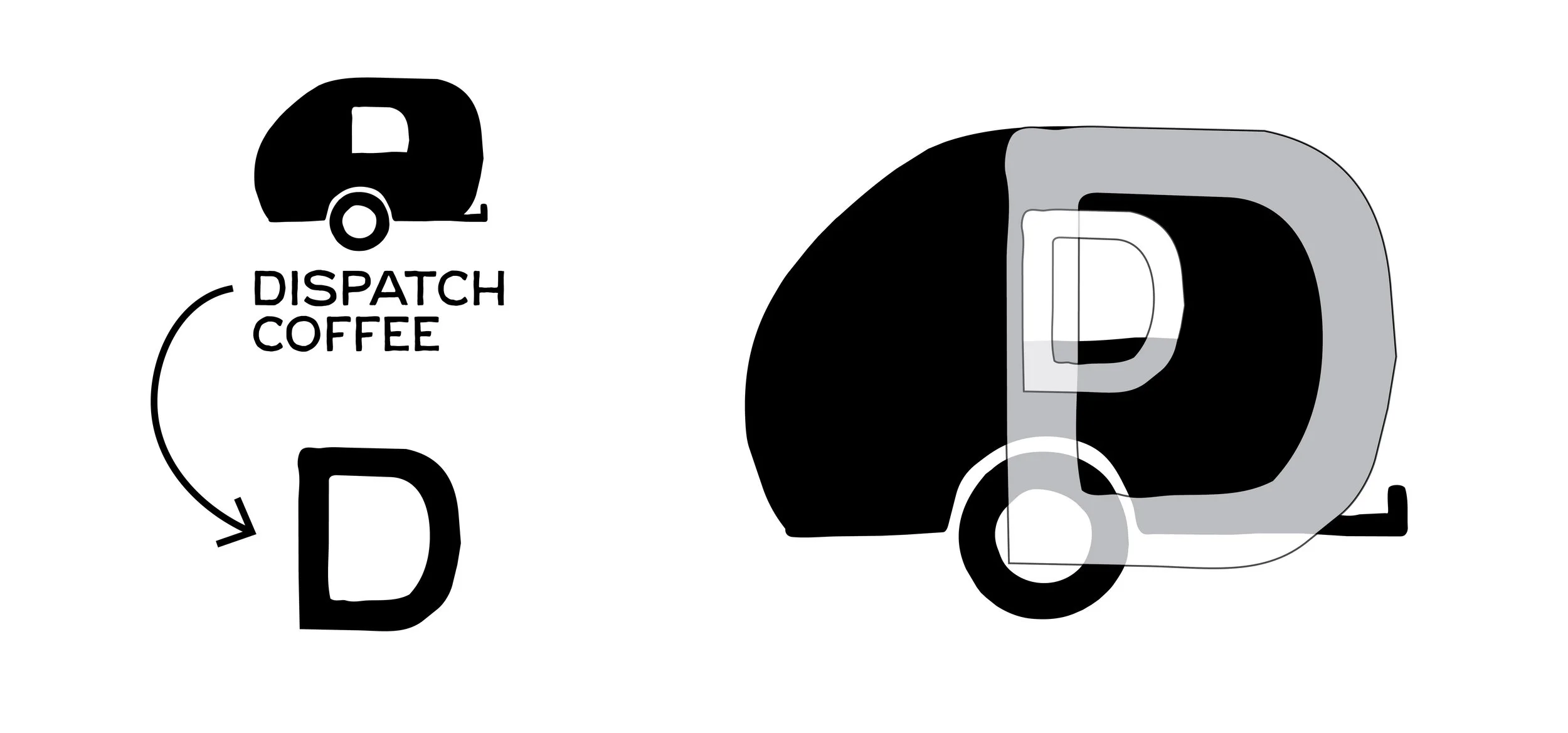
For the logo, I created a hand drawn illustration of the original coffee trailer that started it all. Even though the business has since expanded into a brick and mortar location, the trailer remains a symbol of its origins, perseverance, and the dream that inspired it. The rustic, imperfect linework was intentionally chosen to reflect the shop's handcrafted approach, family roots, and authentic small town character.
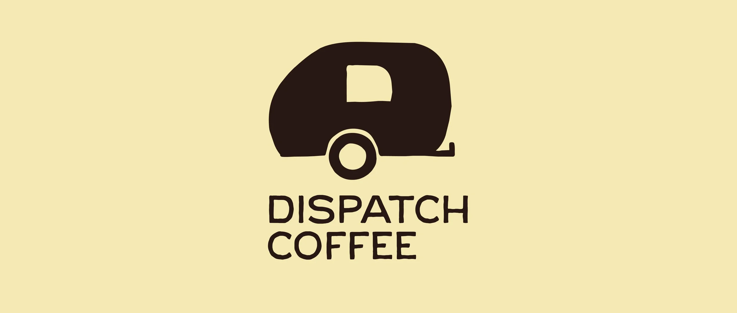
The curves of the trailer illustration were intentionally designed to mirror the shape of the capital “D” in the Dispatch wordmark. This creates a subtle connection between the icon and typography, allowing the two elements to feel unified rather than separate. Repeating the same curved forms throughout the logo helps guide the eye naturally between the trailer and the business name.
Logo Mark


Logo