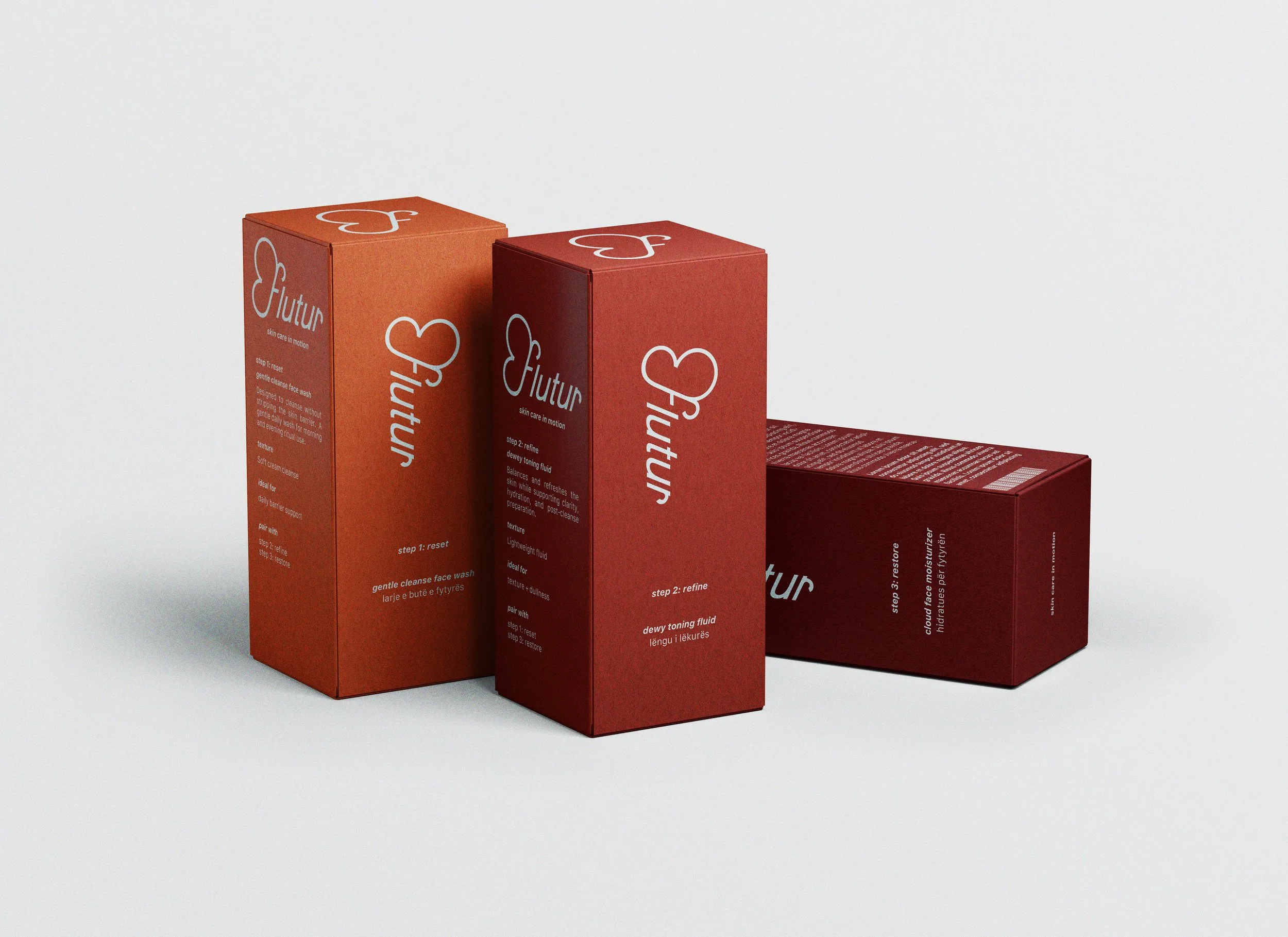
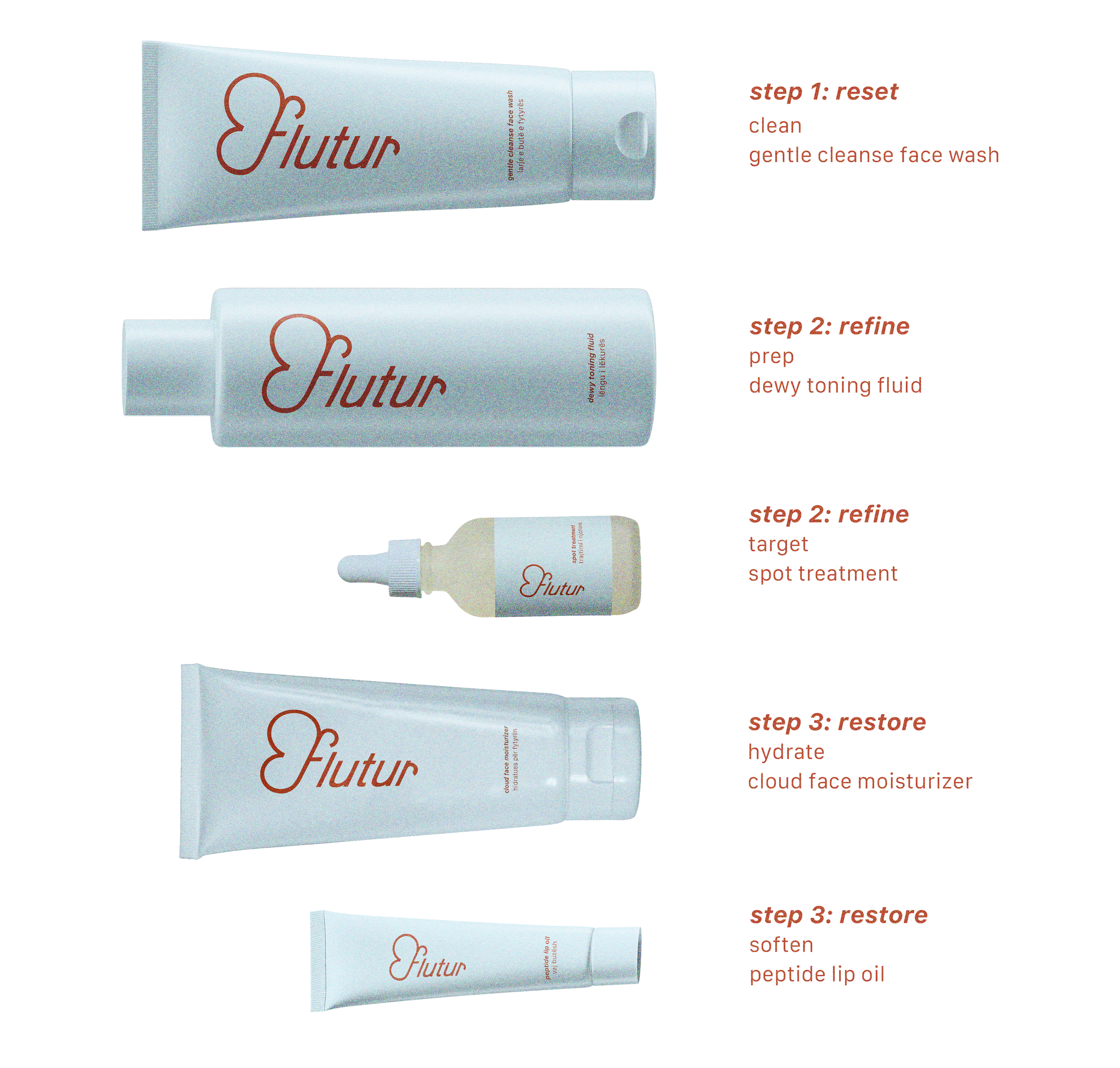
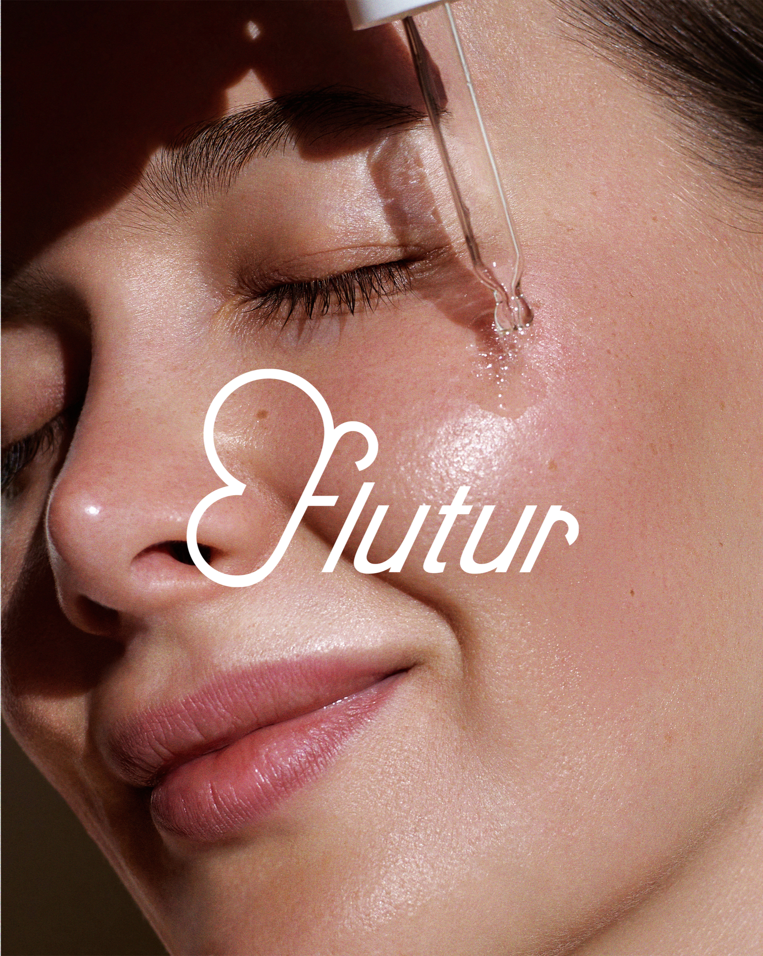
Flutur
Flutur is a clean skincare line based in Albania, created for those with sensitive skin who are looking for something simple, gentle, and truly effective. Built on science-backed ingredients and a minimal approach, the brand cuts straight to what works—removing the overwhelm and making skincare feel easy, clear, and approachable. Rooted in its Albanian origins, Flutur reflects both care and intention, creating space for skin to heal and confidence to grow.
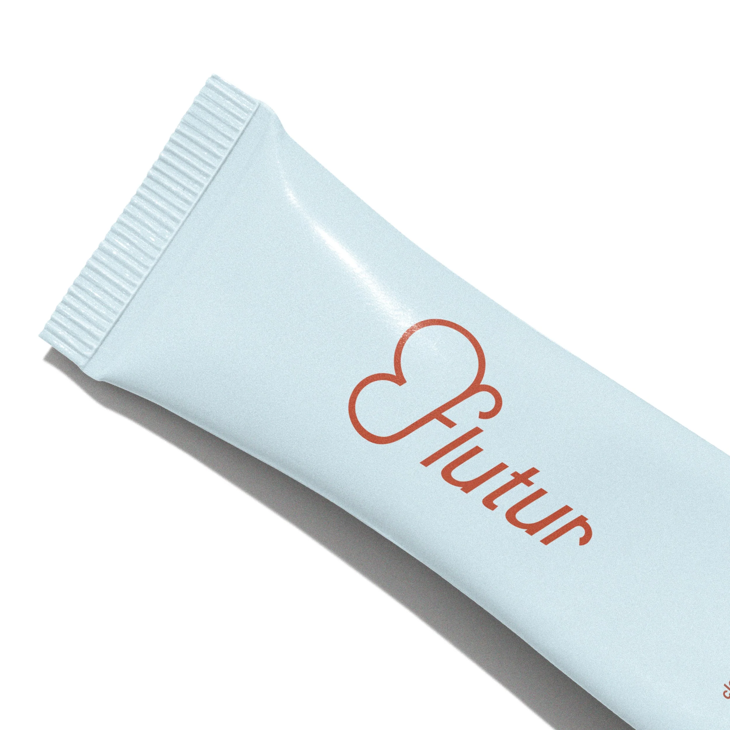
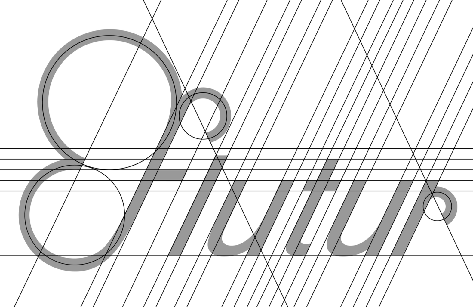
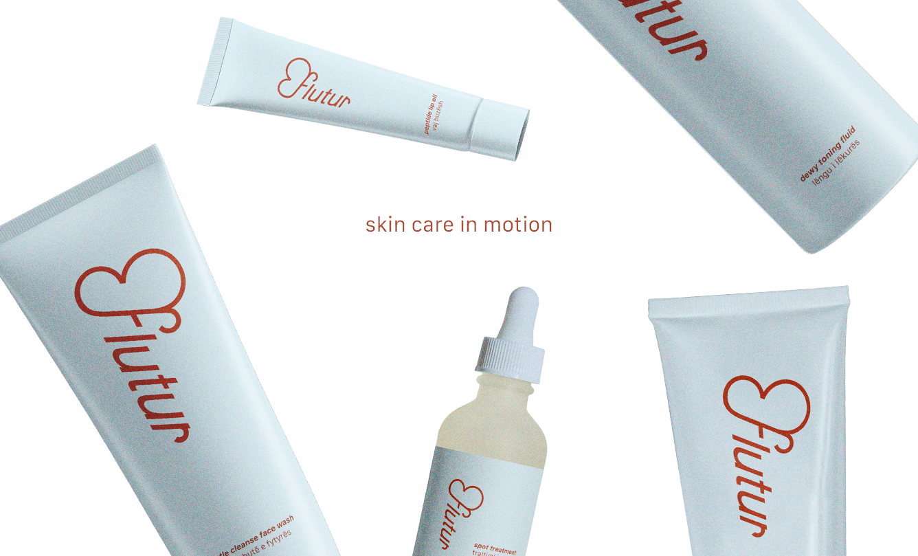
For this project, I developed a brand identity that balances clarity with softness. The challenge was to create something that felt trustworthy and uncomplicated, while still carrying a sense of beauty and meaning. The name “Flutur,” meaning butterfly in Albanian, became a quiet but important influence—subtly reflected in the wordmark and overall form. The identity positions the brand as clean and refined, while still feeling personal and transformative.
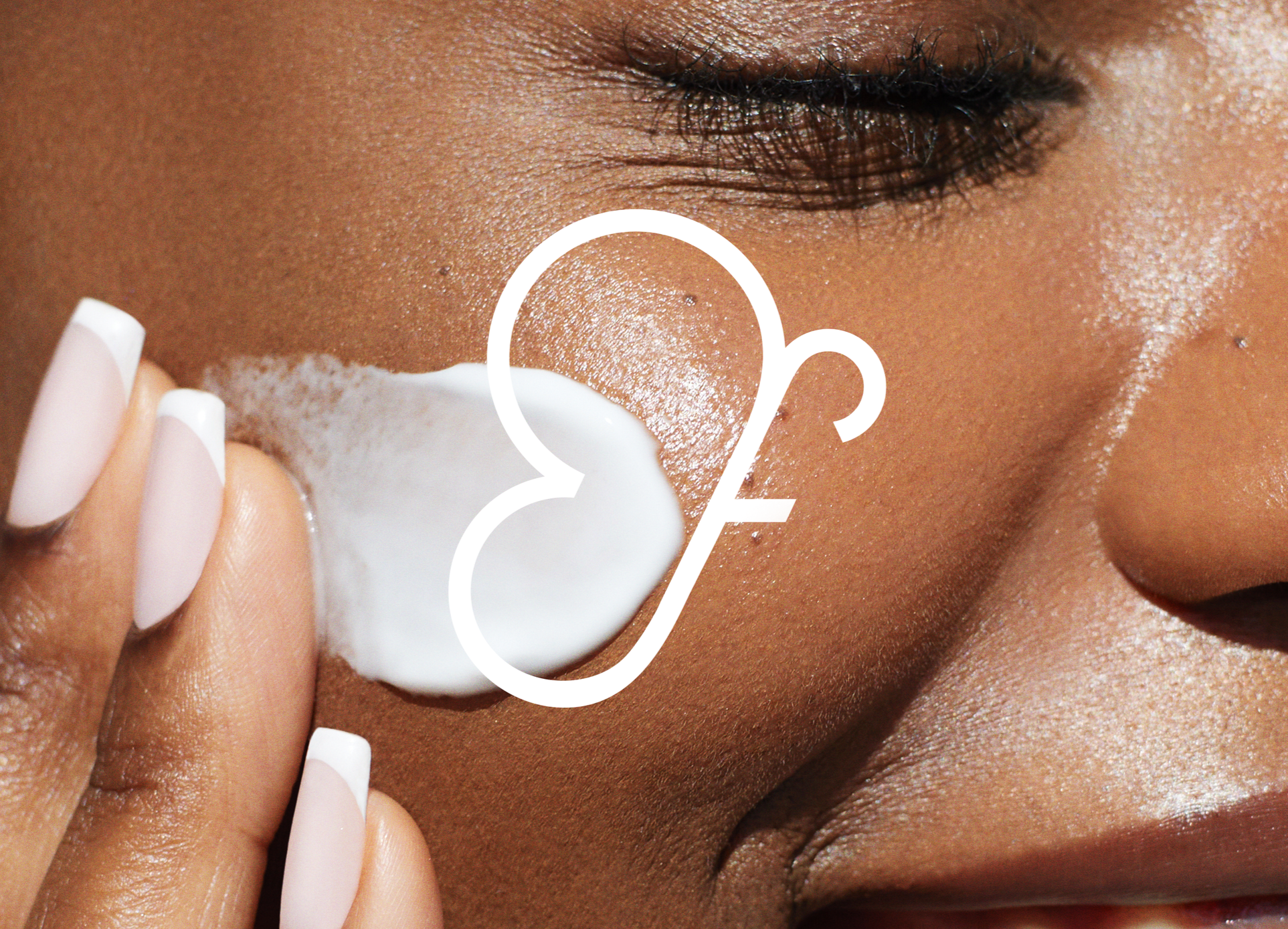
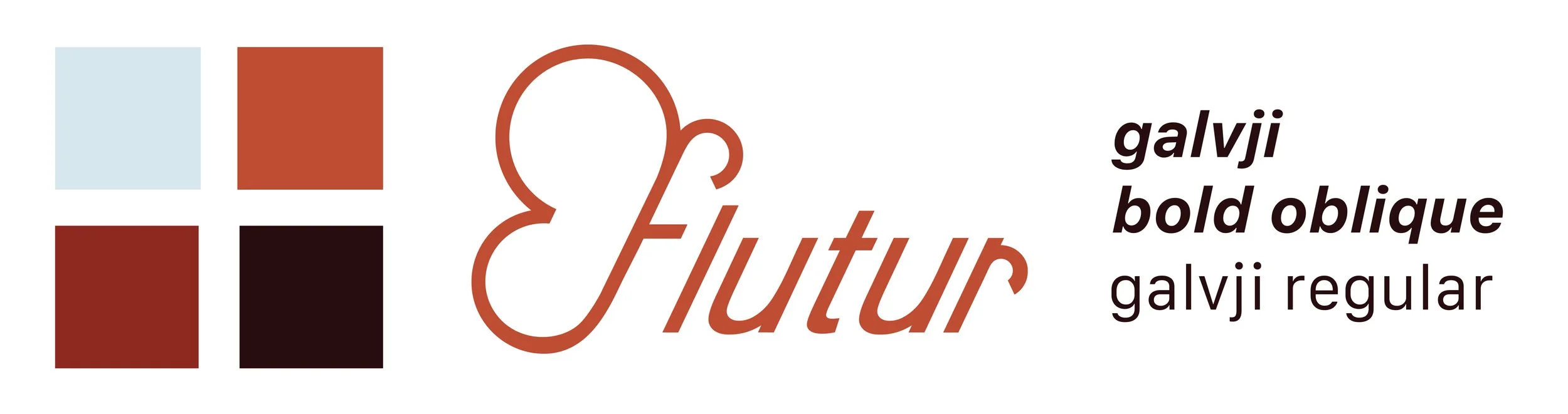
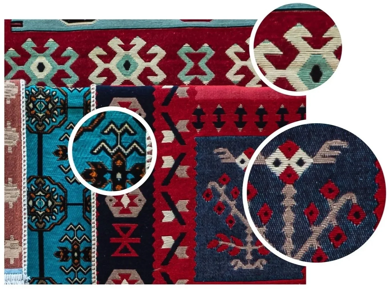
Shape and form were influenced by traditional Albanian embroidery, especially its repeating, curved motifs. I pulled from these rhythms and worked them into the identity, echoing the shapes of the “f” and “r” in the wordmark. The goal was to bring in a sense of craftsmanship and movement, while keeping everything restrained. These elements add depth and intention, but remain subtle enough not to take away from the overall simplicity and clarity of the brand.
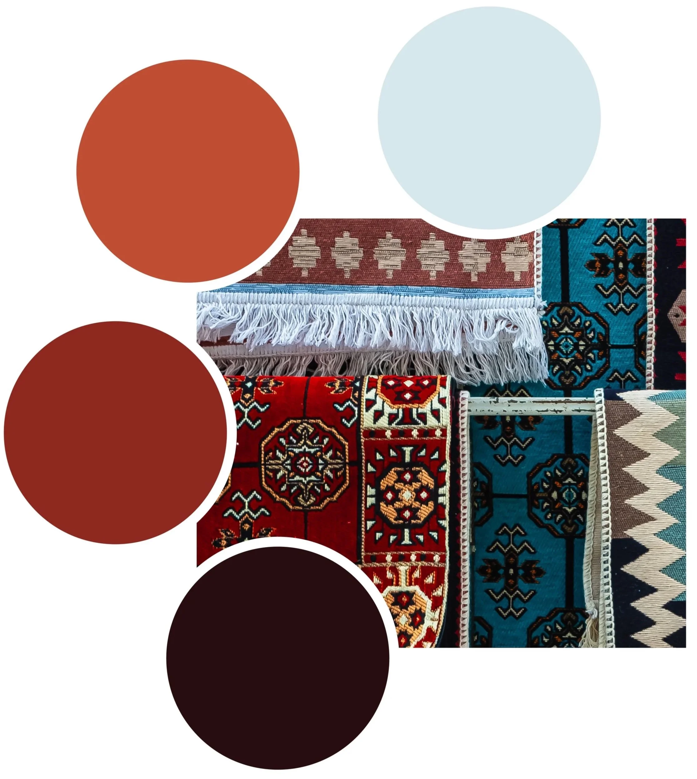
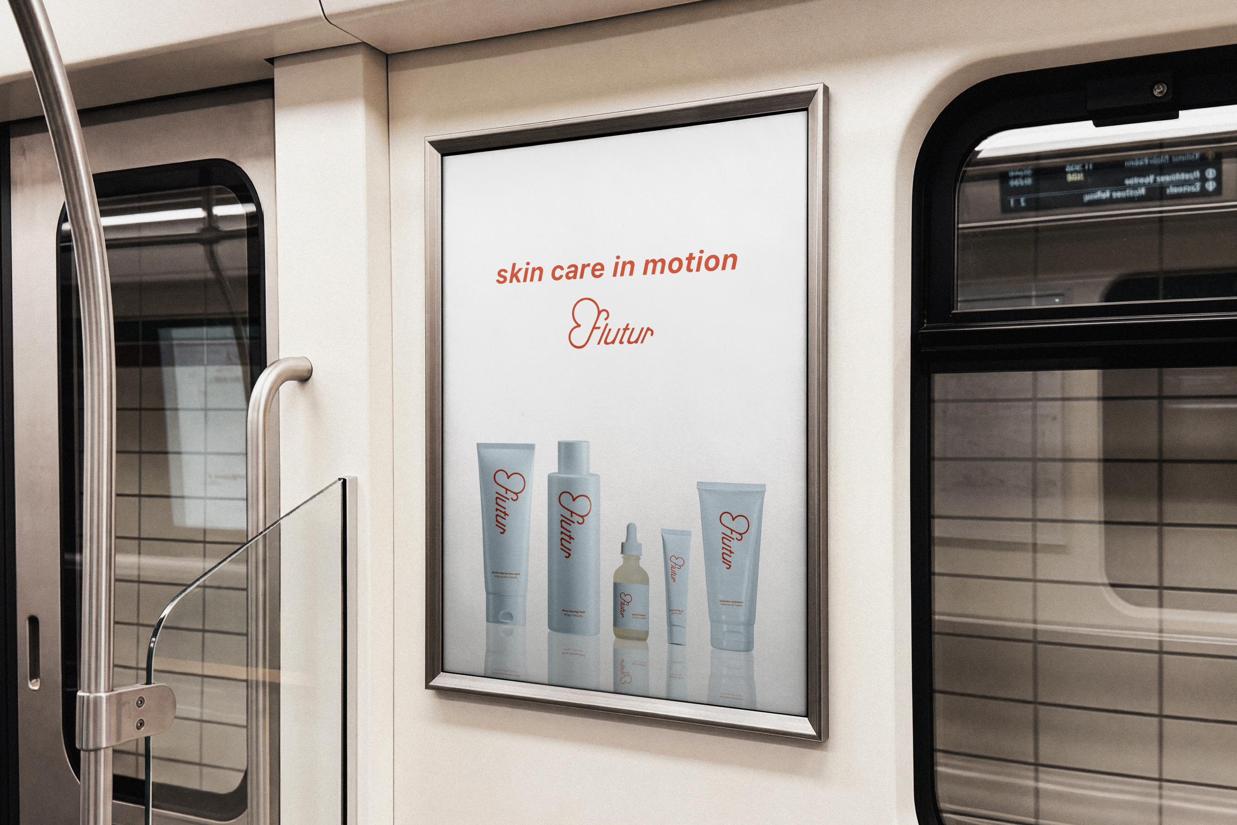
Color was drawn directly from traditional Albanian dress, art, and tapestry—rich reds, warm oranges, deep browns, and soft blues. I translated these tones into a more refined, balanced palette that feels grounded and modern. This allows the brand to carry its heritage visually, while still fitting seamlessly into a clean skincare space that feels elevated.