
Social Hike
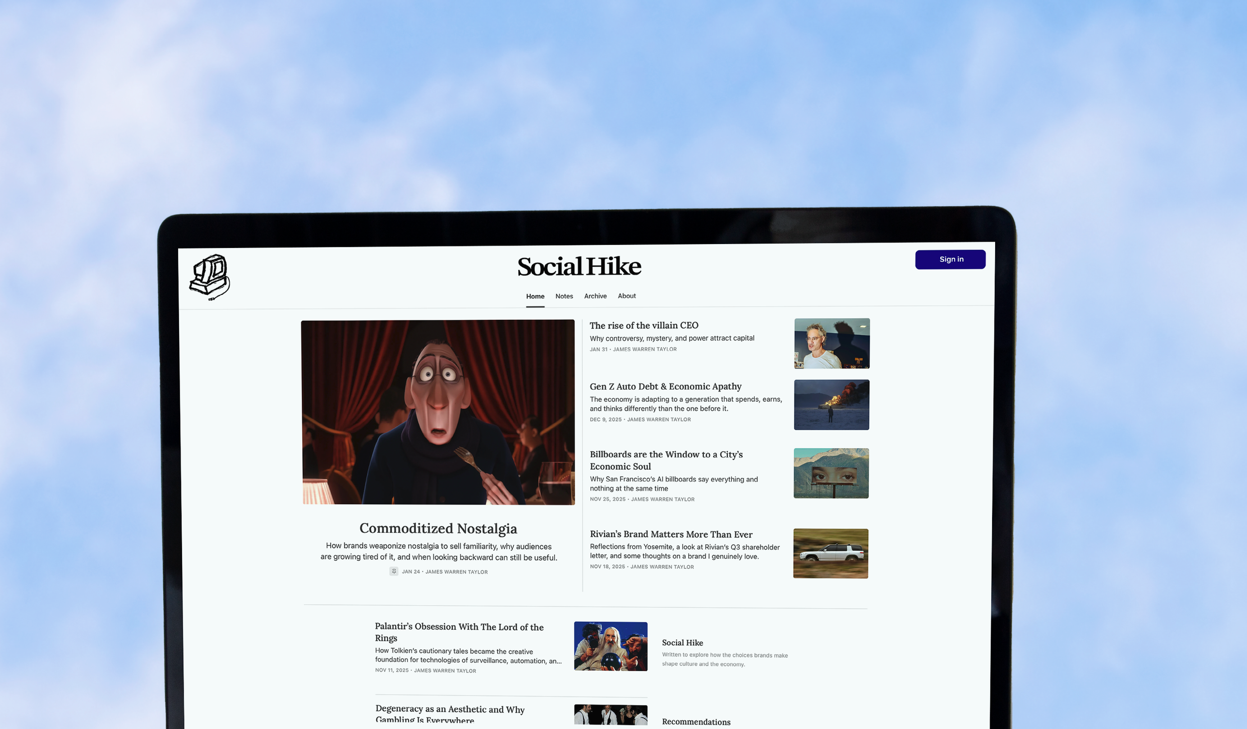
Social Hike is a newsletter centered around the overlap between business, culture, and life online. It explores how brands, trends, and internet culture shape the way we live and think, while also encouraging a healthier balance between digital life and the real world
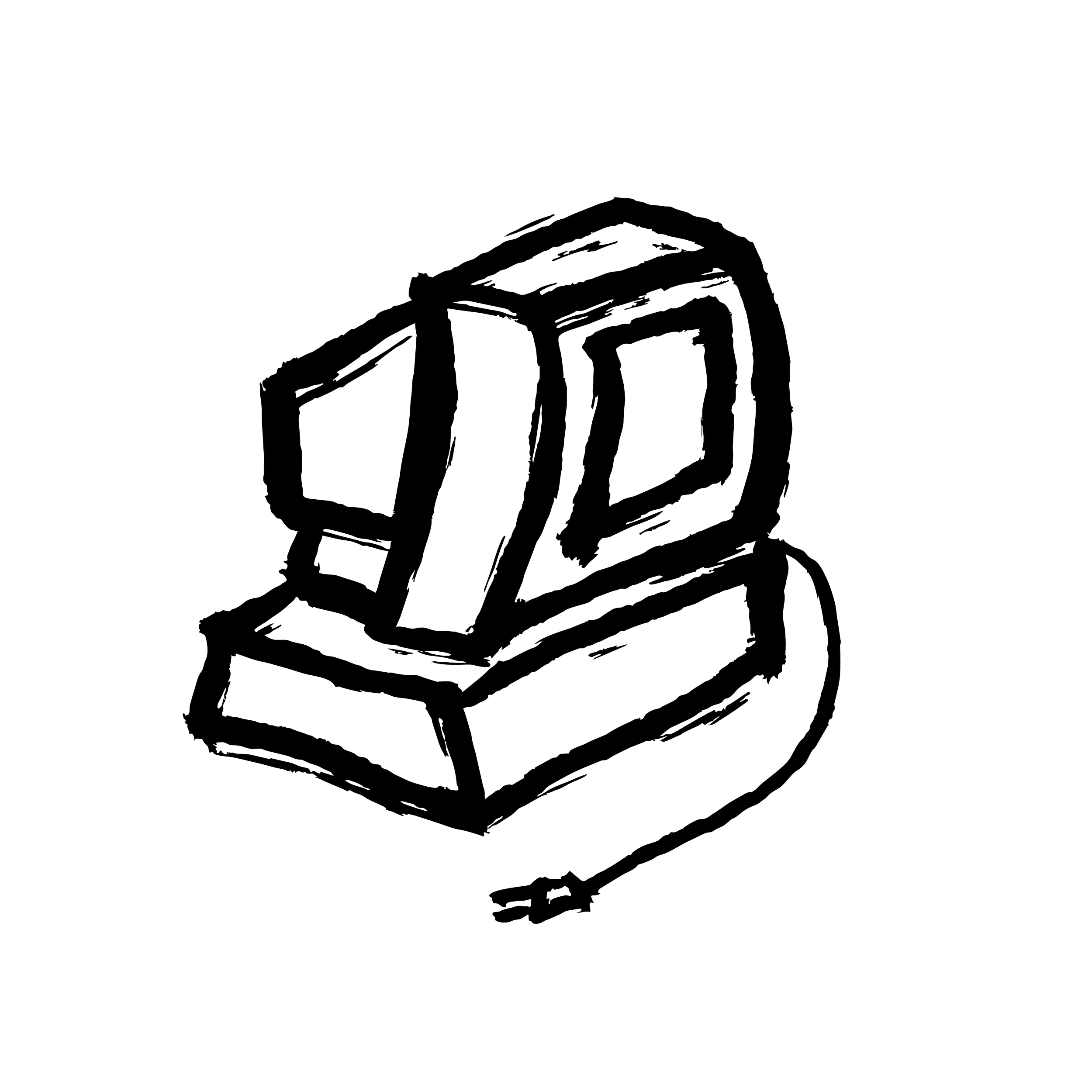
For the logo, I created a rough hand-drawn illustration of an old computer with the cord unplugged. I wanted it to feel a little imperfect and human rather than overly polished or corporate. The unplugged computer acts as a simple visual metaphor for stepping away from the constant noise of the internet and reconnecting with the world outside of it, which ties back to the idea behind the name Social Hike.
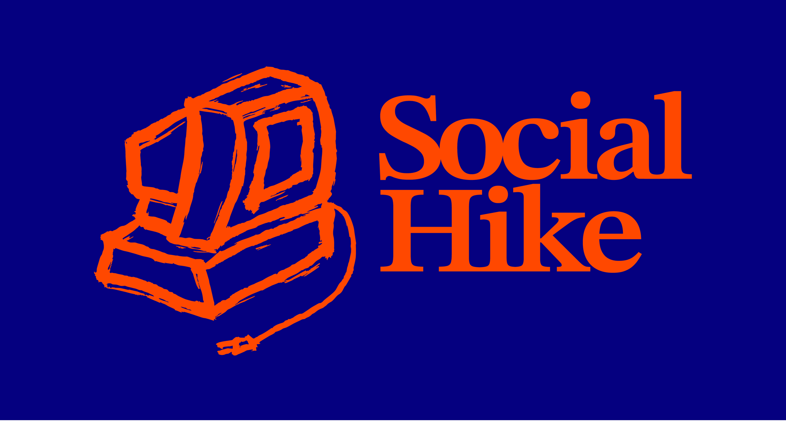
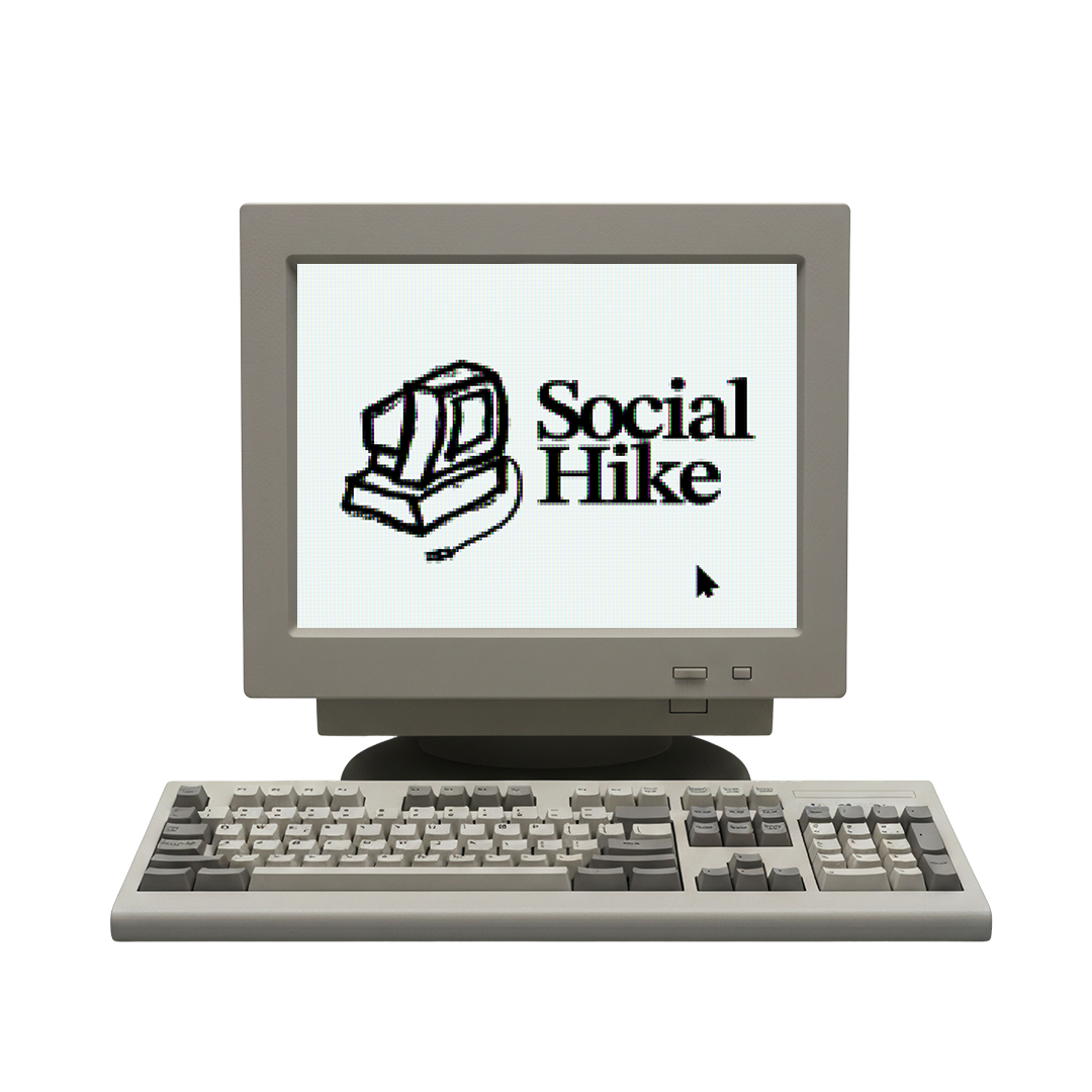

The hand-painted texture and imperfect details became an important part of the final design. Instead of making the illustration feel overly polished or corporate, I kept the rough edges and organic qualities of the original painting so the logo would feel more human and approachable. That slightly nostalgic, handmade look helps support the newsletter’s focus on disconnecting from constant online noise and reconnecting with real world perspective.
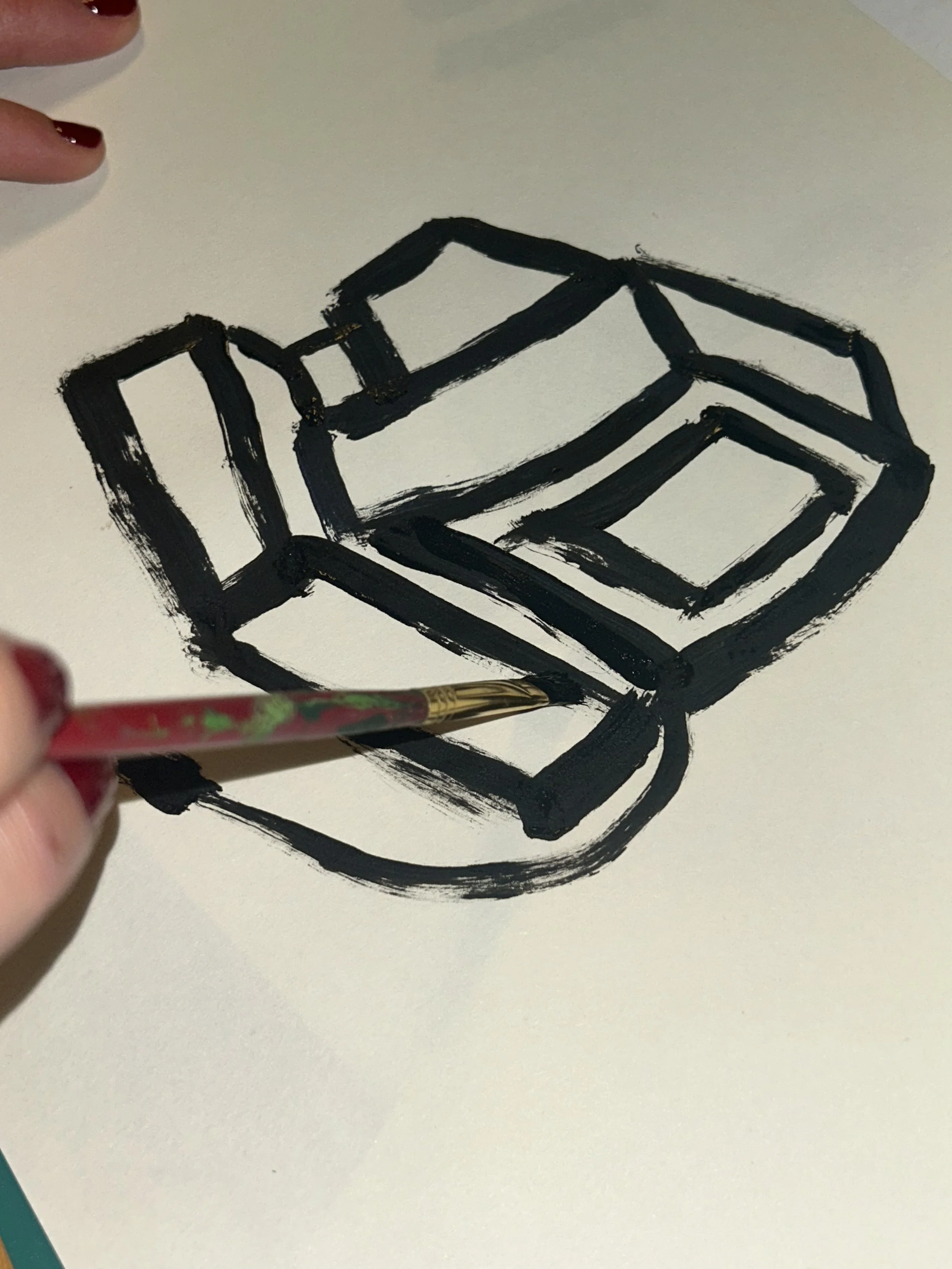
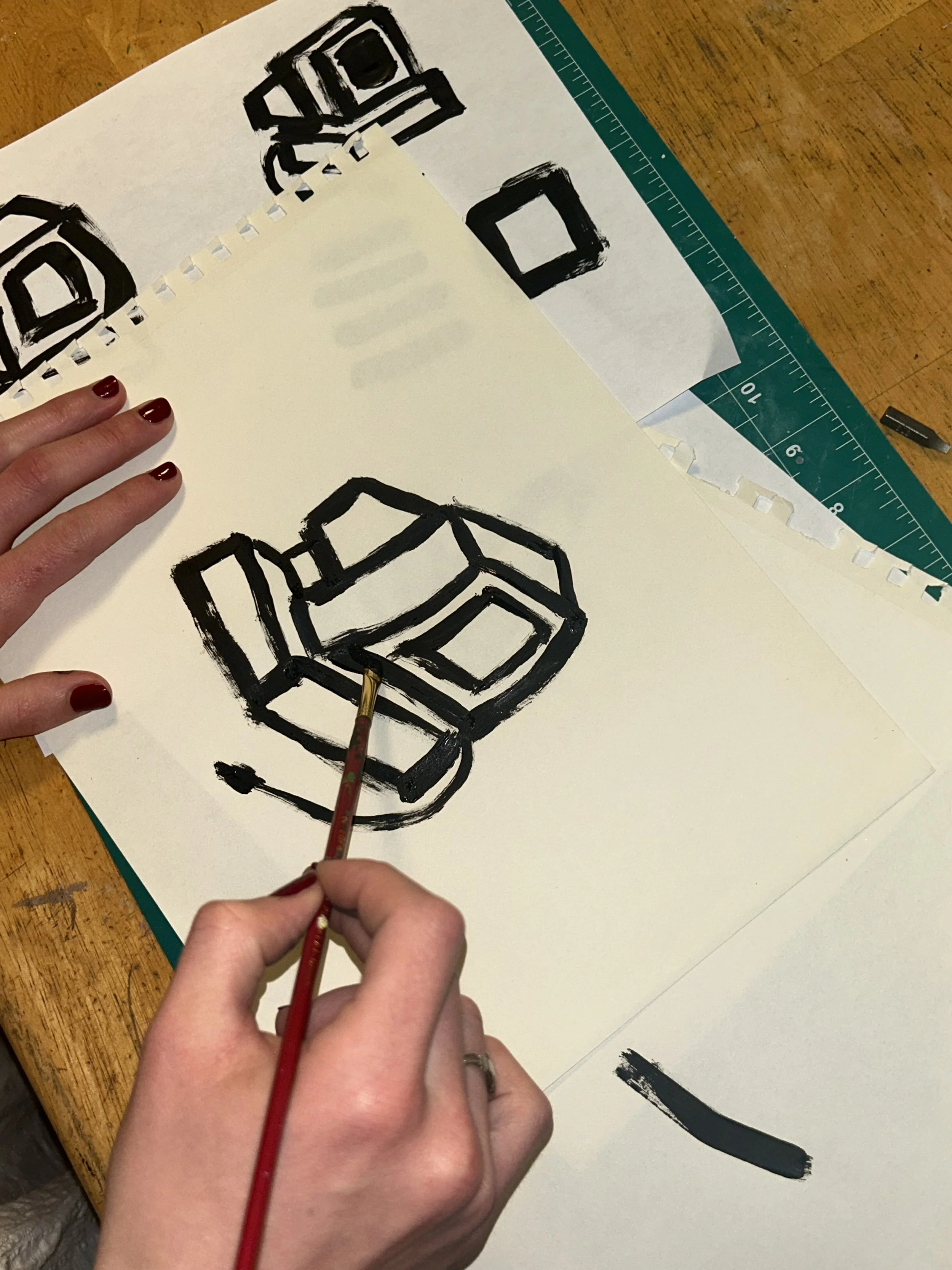
Rather than creating the logo entirely digitally, I wanted the process itself to reflect the meaning behind Social Hike. Since the newsletter is rooted in finding balance outside of online spaces, I intentionally made the artwork by hand in the real world first. I painted the computer illustration traditionally before bringing it into the computer, allowing the process to feel slower, more personal, and more connected to the message behind the brand.
Logo Mark
Word Mark

Logo